Website QA Assessment: Exploratory functional, UI and responsive testing
This published report demonstrates exactly how Cypher QA documents an assessment: reproducible findings, severity classification, screenshot evidence, and a clear release recommendation.
A focused exploratory QA assessment was performed against the publicly accessible OWASP Juice Shop demonstration application. Testing concentrated on normal user-facing behavior: product browsing, product details, reviews, registration and login, basket behavior, responsive layout, and common UI states.
Multiple confirmed UI, responsive, and functional findings were observed. The strongest business-impact findings were the inability to authenticate using a newly registered test account (CY-005) and the ability to add a sold-out product to the basket (CY-006).
7
Findings
1
Major
1
Medium
5
Minor
Status by area
Functional
Authentication and inventory-state behavior require review.
Attention required
Responsive
Several narrow-viewport layout issues observed.
Attention required
UI / Visual
Typography, spacing, and overlap issues observed.
Attention required
Accessibility
Only limited exploratory checks performed.
Not fully assessed
Performance
Basket slowdown observed, but no timing data was captured.
Needs measurement
Test scope
Product browsing and product detail views
Product reviews
Basket / cart quantity behavior
Registration and login flows
Responsive behavior at desktop and narrow viewport widths
Cookie notification behavior
Common UI spacing, typography, and layout states
Normal addition of products to the basket
Environment & approach
Opera on Windows (ultrawide desktop) plus a narrow, mobile-like viewport for responsive checks. Exploratory functional and UI style. No security testing performed.
Assessed on 23 August 2026. Credentials are intentionally omitted from the report.
Findings
Each finding follows the same contract: what actually happens, what should happen, severity, category, and evidence where supplied.
CY-001
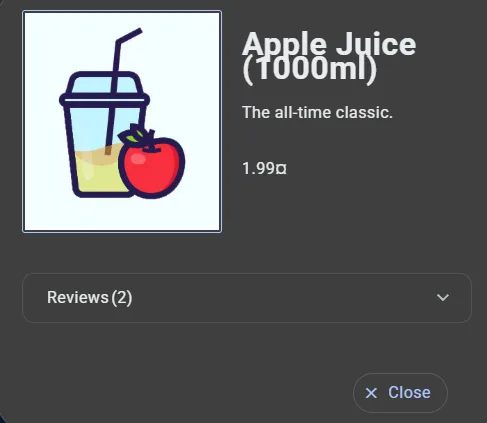
Product title and quantity overlap
minor
Actual: The Apple Juice product title and “(1000ml)” quantity visually overlap in the product details view.
Expected: The title and quantity should remain visually separated with adequate spacing.
UI / Visual · Product Details
Evidence — product title and quantity overlap
CY-002
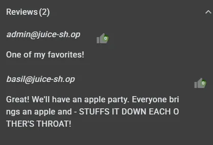
Review text breaks between characters
minor
Actual: Review text can wrap at an unnatural character boundary, producing a word split such as “bri” followed by “ght”.
Expected: Words should wrap naturally without arbitrary character-level breaks where the layout permits.
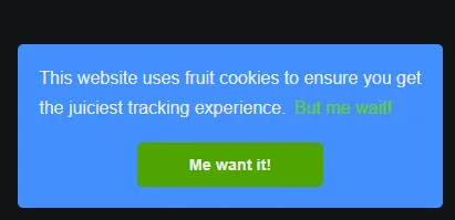
Actual: The cookie notification is displayed without an obvious close/dismiss control; the banner shows its primary action but no visible close control.
Expected: Users should have an obvious way to dismiss the notification where the consent design permits dismissal, and the banner should avoid obstructing important controls at supported viewport sizes.
UX / Cookie Consent · Global UI
Evidence — cookie banner cannot be dismissed
CY-005
Newly registered account cannot authenticate
major
Actual: A test account created successfully through the normal registration flow could not subsequently authenticate using the credentials established during registration. Login returned “Invalid email or password”.
Expected: A successfully registered user should be able to authenticate using the credentials established during registration, subject to any documented verification requirement.
Documented from the observed test result; no screenshot supplied in this version of the report.
CY-006
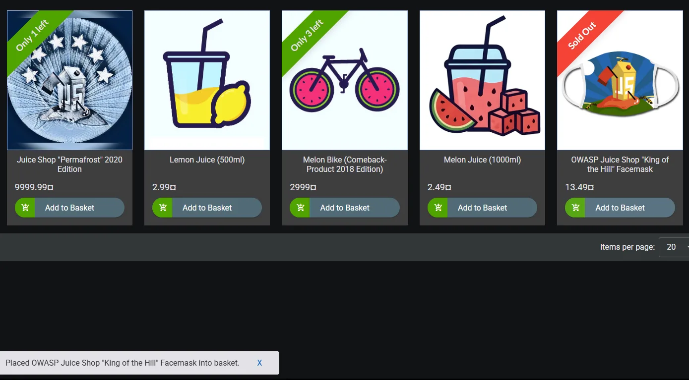
Sold-out products can be added to basket
medium
Actual: A product visibly marked “Sold Out” can still be added to the basket through the normal user interface.
Expected: A sold-out product should either be unavailable for addition or clearly communicate that it cannot currently be purchased.
Functional / Inventory State · Product Listing / Basket
Evidence — sold-out products can be added to basket
CY-007
Mobile Google sign-in button has insufficient padding
minor
Actual: At a narrow/mobile-like viewport, the Google sign-in button has very little horizontal padding and the Google icon sits extremely close to the button edge.
Expected: The button should maintain consistent spacing around its icon and content across supported viewport sizes.
Responsive / UI · Authentication / Registration
Evidence — mobile google sign-in button has insufficient padding
Observations requiring further validation
Basket performance: a noticeable slowdown was observed when the basket contained many items. No timing, item count, trace, or performance profile was captured, so this remains an observation rather than a confirmed performance defect.
Quantity control at one item: the minus control did not reduce a quantity of one to zero. This may be intentional if the item is expected to be removed through a separate control; validate intended UX before classifying it as a defect.
Observations are deliberately kept separate from confirmed defects: reporting a performance problem without measurement data would be speculation, not QA.
Recommendations
01Review the registration/authentication flow to determine why newly created accounts cannot authenticate.
02Prevent sold-out inventory from being added to the basket, or clearly communicate the intended behavior.
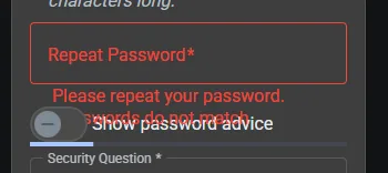
03Correct responsive layout collisions involving the cookie banner and registration controls.
04Correct typography/wrapping behavior in product titles and review content.
05Review responsive spacing for authentication controls, including the Google sign-in button.
06Re-test all affected areas after fixes and perform regression checks around registration, product display, and basket flows.
07Measure basket performance using defined item counts and browser performance/network data before raising a formal performance defect.
Final release recommendation
HOLD / FIX AND RETEST
Based on the limited exploratory scope, the application should not be treated as release-ready without review of the confirmed authentication and inventory-state findings and correction of the identified responsive/UI issues. A full release decision would require broader browser/device coverage, additional functional coverage, and regression testing.
This web page is a faithful representation of the downloadable DOCX report. The original document remains the canonical version of the assessment.